auguste herbin
︎Artist, Painting, Abstract
︎ Ventral Is Golden
auguste herbin
︎Artist, Painting, Abstract
︎ Ventral Is Golden
︎ Ventral Is Golden
"Colours are light’s suffering and joy."
- Johann Wolfgang von Goethe
- Johann Wolfgang von Goethe
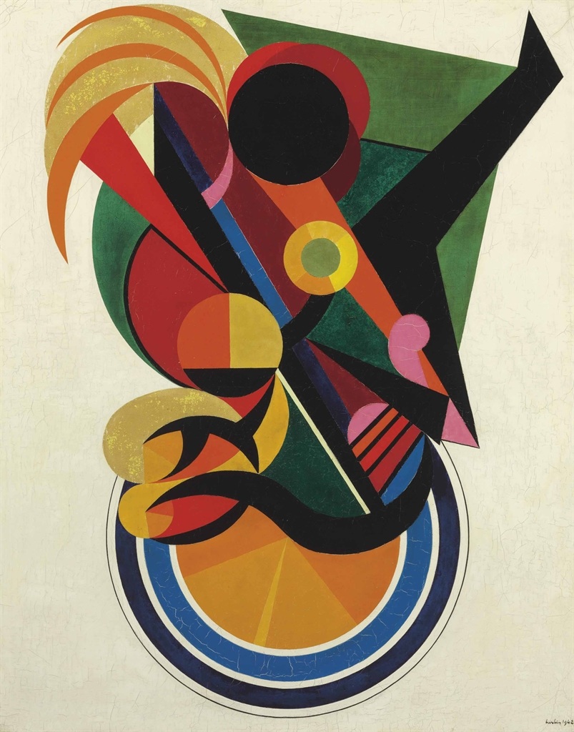
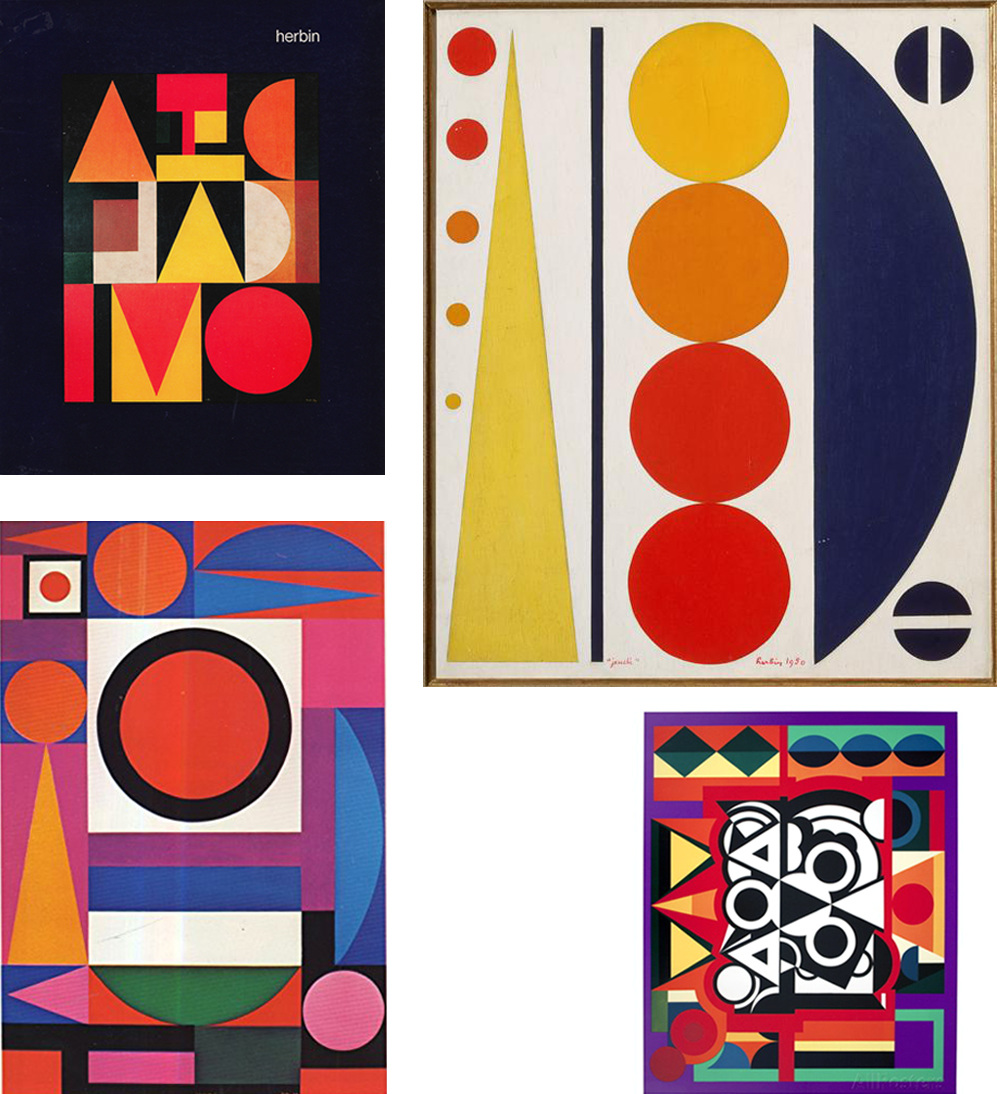
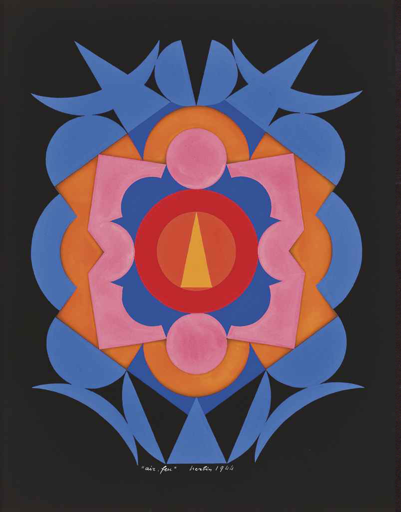
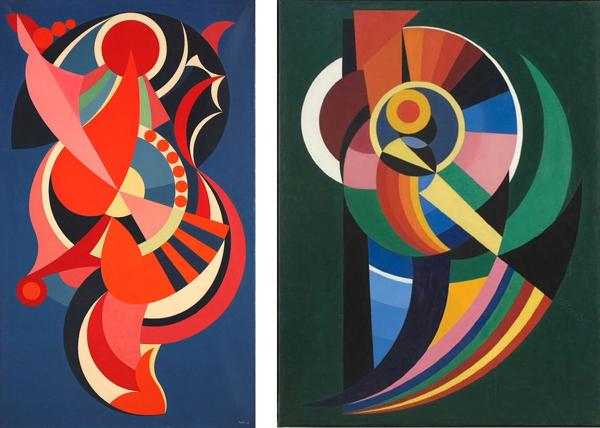
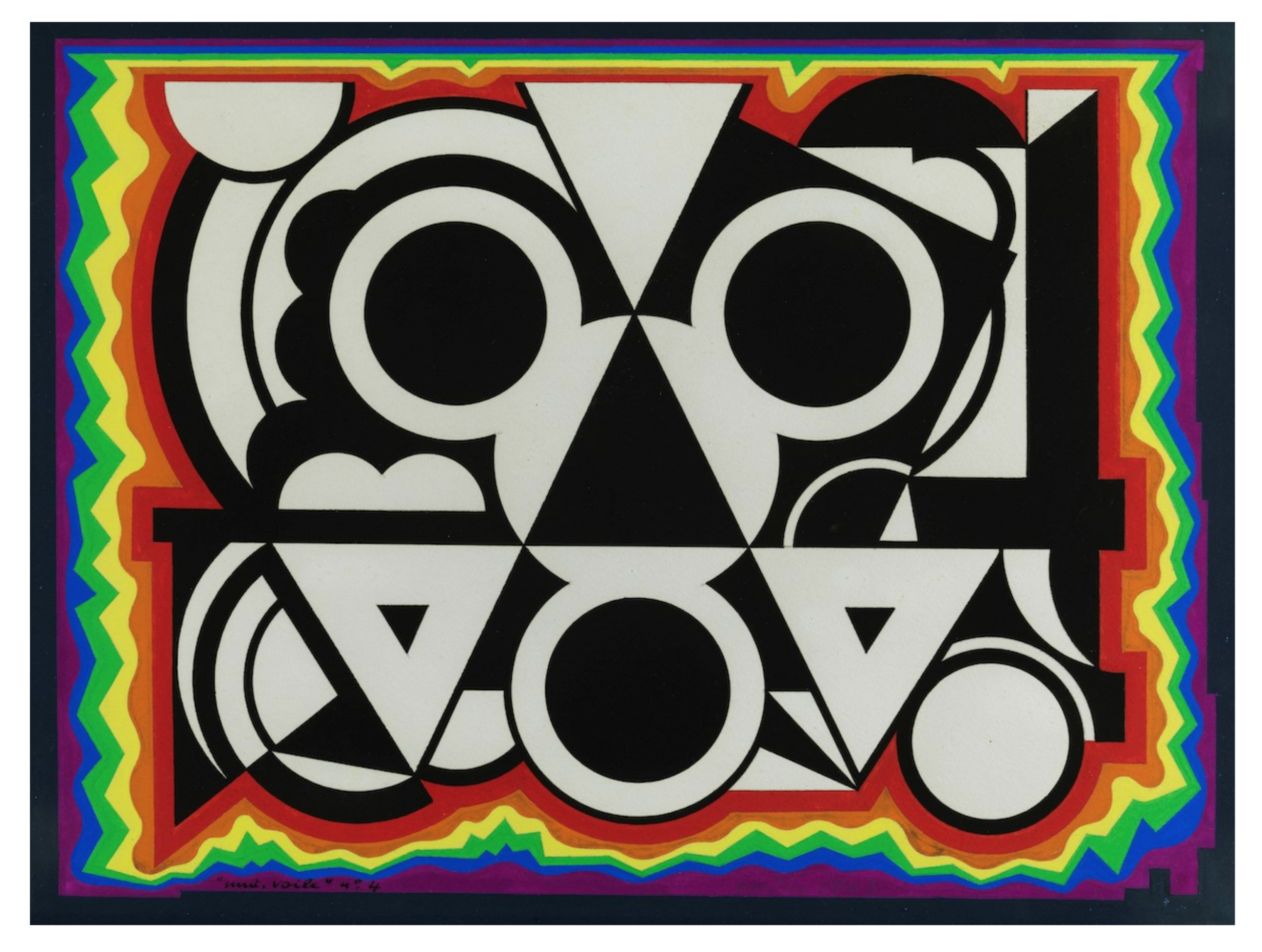
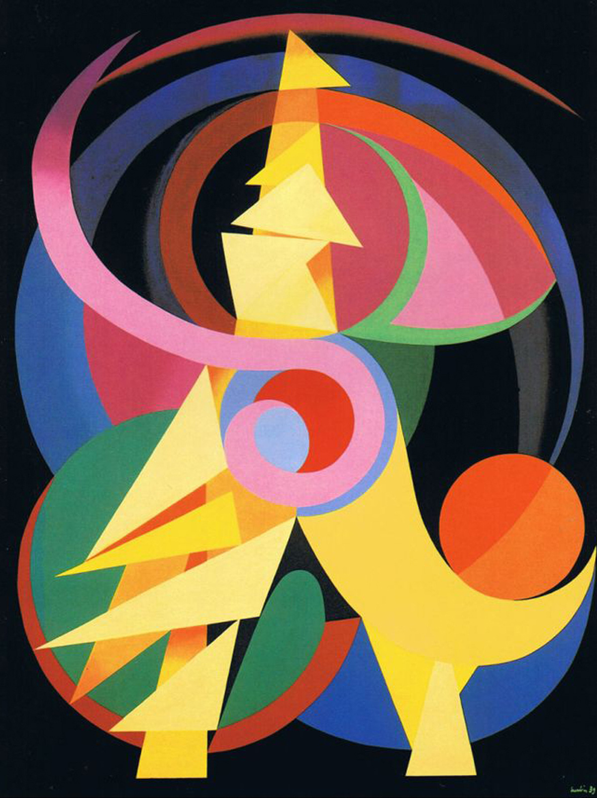
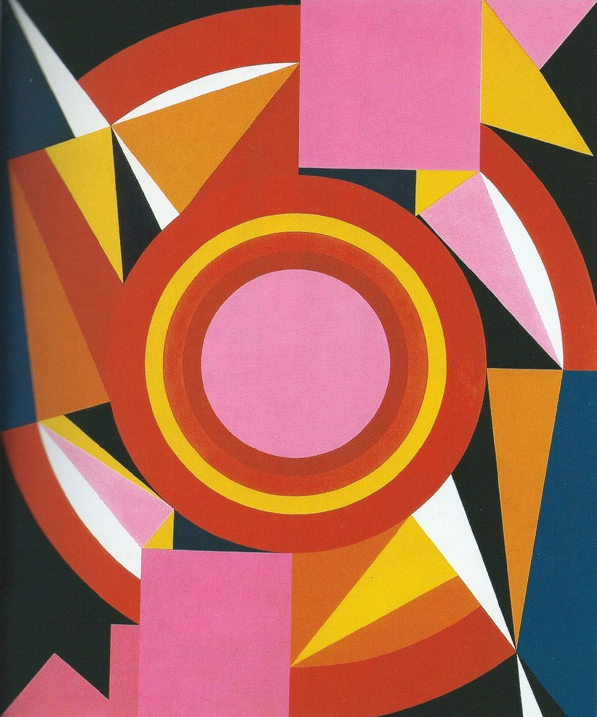
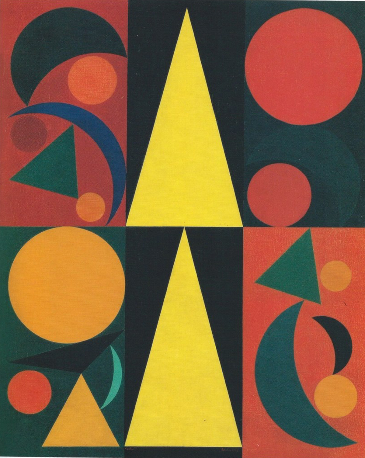
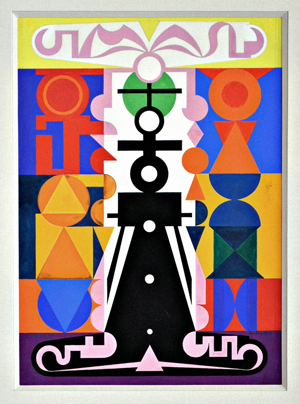
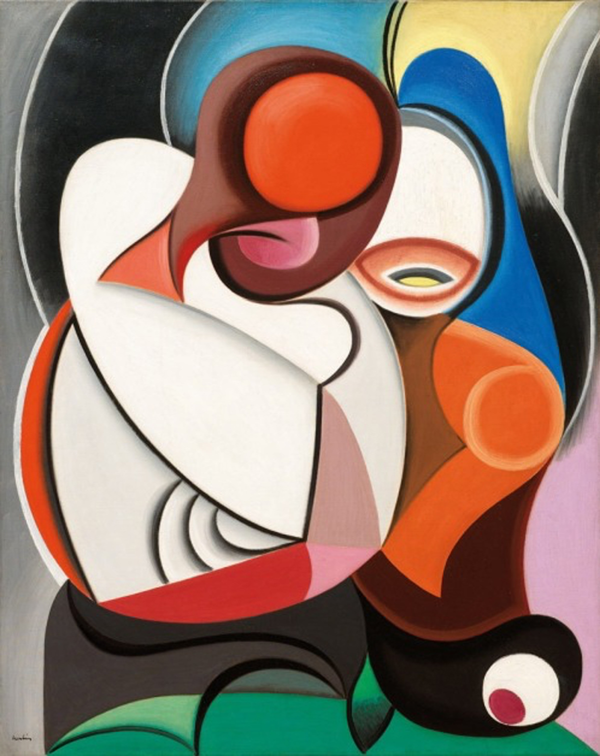
Best known for his abstract paintings of colourful geometric figures, Auguste Herbin’s work ranged from Constructivism to Cubism and also explored an expressive, visual language system, where each letter was assigned a colour and shape. Linking to psychological colour theory, his visual language became a compositional puzzle that exposed the architectural relation of words to the geometry of their psychic space.
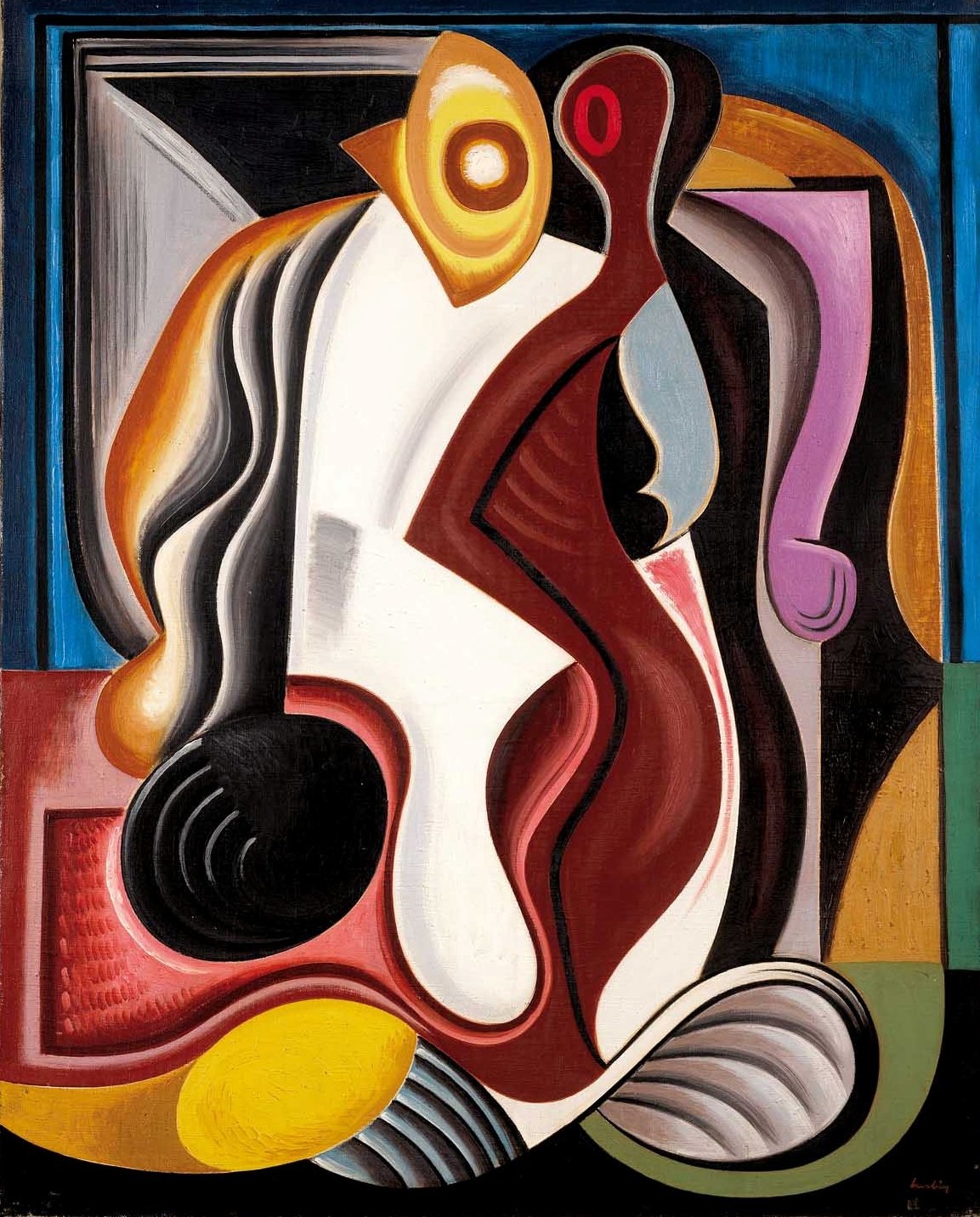
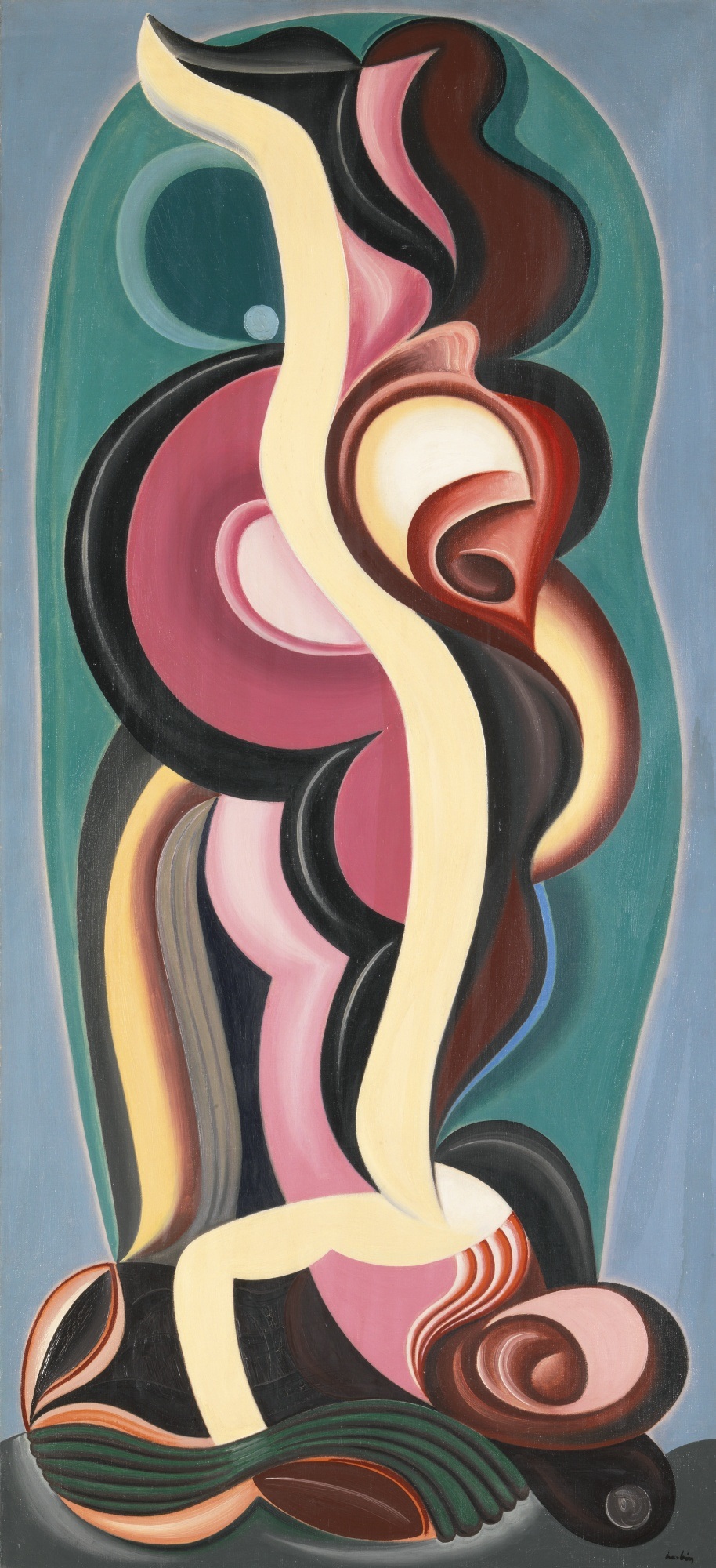
Born into a working class family of weavers, Auguste Herbin (1882-1960) began his artistic career as a painter of realistic landscapes. In his early twenties, Herbin settled in Paris, where he first joined the Impressionists and later the Fauvist art movements. He would become heavily influenced by the serendipity of having his studio next to the likes of Georges Braque and Pablo Picasso, enabling him to pursue a detailed study of the early developments of Cubism.
In 1914, at the outbreak of World War I, he was exempt from military service because of his short stature and was committed instead to work in an aeroplane factory near Paris, after which, (perhaps partly influenced by the mechanistic nature of assembly-line work), he shifted his perspective into an abstract, geometric style that subverted the linear approach to reading print and blended it with the multi-perspective nature of Cubism.
Generally speaking, changes in visual styles have been the result of shifts in social paradigms of the time, as a way of aligning with or exposing the potential changes of psychology within the new dominant technology.
A new kind of mechanisation and industrial process was the character of the zeitgeist, and Cubism, as many cultural transitions often do, looked back into the past, into the deep historical motifs that characterised the 'naive' visual traditions of Hunter-Gatherer societies, in what amounts to a future psychological notalgia for the archaic.
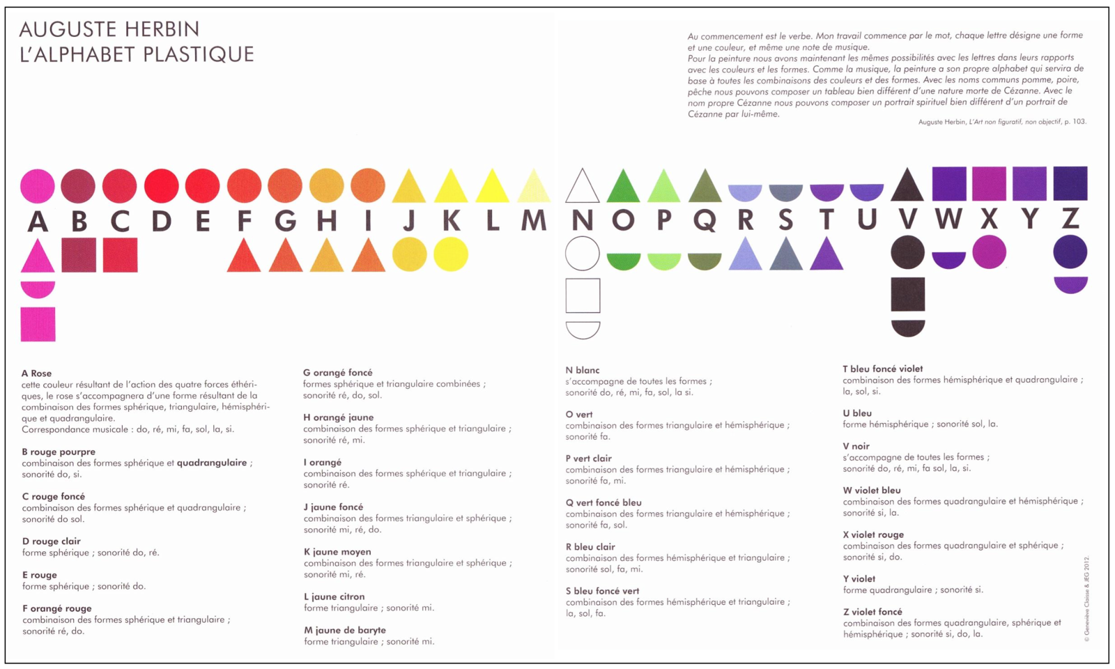
For Herbin, this futurist rendering of nostalgia was embodied in his own visual language system; a melange of spiritual, philosophical, architectural and mechanistic impulses that pertained to the total environment of the senses, in what he called ‘The Alphabet Plastique.’
Born into a working class family of weavers, Auguste Herbin (1882-1960) began his artistic career as a painter of realistic landscapes. In his early twenties, Herbin settled in Paris, where he first joined the Impressionists and later the Fauvist art movements. He would become heavily influenced by the serendipity of having his studio next to the likes of Georges Braque and Pablo Picasso, enabling him to pursue a detailed study of the early developments of Cubism.
In 1914, at the outbreak of World War I, he was exempt from military service because of his short stature and was committed instead to work in an aeroplane factory near Paris, after which, (perhaps partly influenced by the mechanistic nature of assembly-line work), he shifted his perspective into an abstract, geometric style that subverted the linear approach to reading print and blended it with the multi-perspective nature of Cubism.
Generally speaking, changes in visual styles have been the result of shifts in social paradigms of the time, as a way of aligning with or exposing the potential changes of psychology within the new dominant technology.
A new kind of mechanisation and industrial process was the character of the zeitgeist, and Cubism, as many cultural transitions often do, looked back into the past, into the deep historical motifs that characterised the 'naive' visual traditions of Hunter-Gatherer societies, in what amounts to a future psychological notalgia for the archaic.
For Herbin, this futurist rendering of nostalgia was embodied in his own visual language system; a melange of spiritual, philosophical, architectural and mechanistic impulses that pertained to the total environment of the senses, in what he called ‘The Alphabet Plastique.’
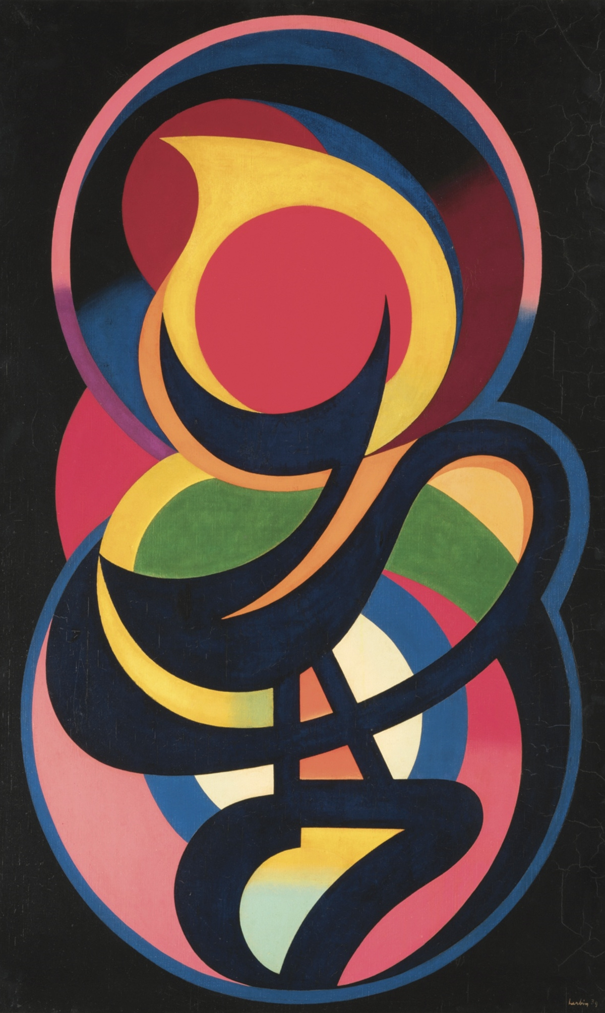

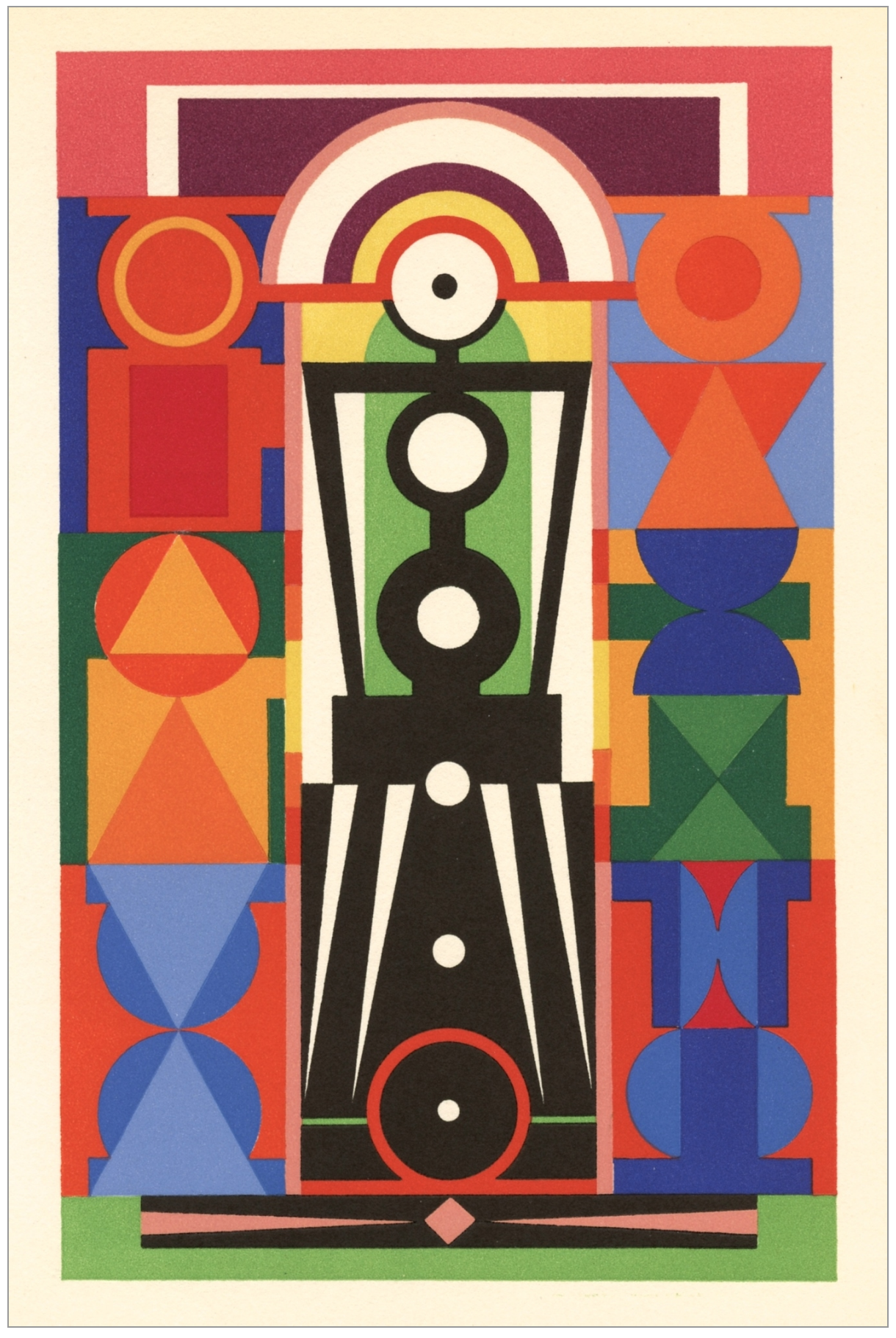
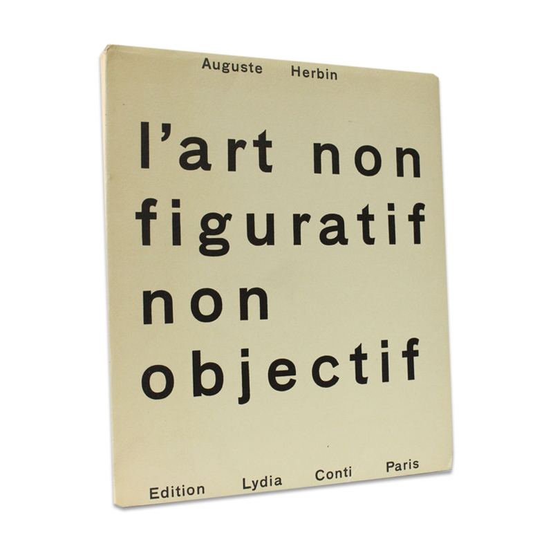
By 1946, Herbin began to elaborate a compositional system based on the structure of alphabetical letters. In a similar vein to Alexander Scriabin's theosophically inspired 'Mysterium' and 'clavier à lumières', each letter of Herbin's system was a simplified shape with a multitude of connotations relating to colour, form and psychic resonance. He would later publish this compositional system, as well as other colour theories (partly derived from Goethe's "Farbenlehre"), in his "L'art non-figuratif non-objectif" in 1949.
![]()
![]()


The Farbenlehre (Colour Theory) of Goethe, from which Herbin's Alphabet Plastique took its inspiration, was in fact not a theory, but a catalogue of observations regarding how the eye perceives colour. In part a critique of Newton's mathematical approach to understanding light, the critique maintained that Newton had mistaken mathematical imagining as pure evidence of the senses, whilst Goethe tried to define the scientific function of imagination: to interrelate phenomena once they have been meticulously produced, described, and organised... (Dennis L. Sepper, 2009).
The aim of Goethe's colour theory was not to give precedence to a mathematical framework at the expense of feeling, but to incorporate the 'poet's intuition', and to include the psychological affects that colour had on the individual. This is evident in Goethe's colour wheel, where allegorical and symbolic uses of colour were applied to categories such as Beauty (red), Nobility (orange), Good (yellow), Useful (green), Common (blue) and the Unnecessary (violet). These six qualities were then categorised into a further four categories of human cognition, where combinations of colour, such as red (beauty) and violet (unnecessary) would result in the category relating to 'Phantasie' (imagination).
Herbin's Alphabet Plastique, and his later works, share similar leitmotifs with other art and cultural movements that strove to find the humanitas within every transition brought about by technological development. From the Theosophists, who tried to establish a Hindu spiritual revival in India, to Neo-Tantrism, who offered the Western mind an alternative to the utilitarian rationality that rendered Tantra so exotic, to the Futurists and Cubists, who reinvented space and perspective in the age of automation (to varying degrees of political consequence). Herbin's Alphabet Plastique at its most simplistic was an attempt to reunite nature with the symbolic references we use to describe it.
“Blue... has a peculiar and almost indescribable effect on the eye. As a hue it is powerful - but it is on the negative side, and in its highest purity is, as it were, a stimulating negation. Its appearance, then, is a kind of contradiction between excitement and repose.” - Goethe.

The visual language system itself is an echo of earlier pictorial language systems that originally spoke in multiplicities, bringing into existence not only the thing that was being directly described but also the potential for where that object was situated in a ritual and cosmological sense.
The Egyptian Medu-Neteru (Neters, Numbers, Deities, Hieroglyphs) was just one language system that adopted this kind of holistic view, making it a 'living language'.
As renowned Theosophist and student of Goethe, Rudolf Steiner once alluded in his 1908 Frankfurt lecture series, that the Egyptian mind would know precisely how the individual organs of the human body corresponded with all the substances of the external world. From the use of colour, language, architecture, medicine, and so on, the ancient Egyptian would still interpret these as aspects of the same subject.
Colour was regarded as an integral element of ancient cosmology. Wadj-wer, the Goddess of fertility, was often depicted in green (wadj) and sometimes referred to as 'The Great Green'.
Egypt itself was referred to as Kemet by the indigenous, after the colour black (kem), and the annual flooding of the Nile, that coloured its banks in a black fertile silt.
This kind of confluence between abstract symbology and the arising of phenomena, gave us the first study of natural science, Al Kīmiyā, or Alchemy - a combination of Egyptian and Greek natural philosophy (emanating from Tus, Iran, via the arabic mystic Gerber). This combination was concerned with transmutating spirit into matter, and later became what is known today as Chemistry.

Colours are an essential part of how we perceive the world, from biological perspectives (such as chromatophores, the colour sensitive cells used in communication and camouflage), through to cultural perspectives (such as the relative effects of colours on Placebo and drug effectiveness).
Colour is not merely in the interest of market researchers, but instead, colour plays an entirely deeper psychological and spiritual role in our lives. In collaboration with shape and form, it can either coerce and direct certain psychological responses, or articulate emotions through time and space. After all, colour is simply a frequency - a resonance - an echo of light’s suffering and joy.
As Marshall McLuhan also once stated in ‘Understanding Media’ (1964), our words are our worlds, our dwelling places, as the alphabet is the architectural device of sedentary civilisations.
“Men live in round houses until they become sedentary and specialized in their work organization. Anthropologists have often noted this change from round to square without knowing its cause. The media analyst can help the anthropologist in this matter, although the explanation will not be obvious to people of visualculture… A tent or a wigwam is not an enclosed or visual space. Neither is a cave nor a hole in the ground. These kinds of space - the tent, the wigwam, the igloo, the cave - are not "enclosed" in the visual sense because they follow dynamic lines of force, like a triangle. When enclosed, or translated into visual space, architecture tends to lose its tactile kinetic pressure. A square is the enclosure of a visual space; that is, it consists of space properties abstracted from manifest tensions… A square moves beyond such kinetic pressures to enclose visual space relations, while depending upon diagonal anchors. This separation of the visual from direct tactile and kinetic pressure, and its translation into new dwelling spaces, occurs only when men have learned to practice specialization of their senses, and fragmentation of their work skills. The square room or house speaks the language of the sedentary specialist, while the round hut or igloo, like the conical wigwam, tells of the integral nomadic ways of food-gathering communities.” (source)


Further Reading ︎
The Power of Drug colour, The Atlantic, article
Egyptian Myths, article
Artist Biography, Art Market
Theory of Colours, Goethe, review
Goethe, Newton, and the Imagination of Modern Science, Dennis L. Sepper
Theory of colours, Newton & Goethe chart of differences, wiki