interview: nick liefhebber
︎Artist, Graphic Design, Sculpture, Illustration, Interview
︎ Ventral Is Golden
interview: nick liefhebber
︎Artist, Graphic Design, Sculpture, Illustration, Interview
︎ Ventral Is Golden
︎ Ventral Is Golden
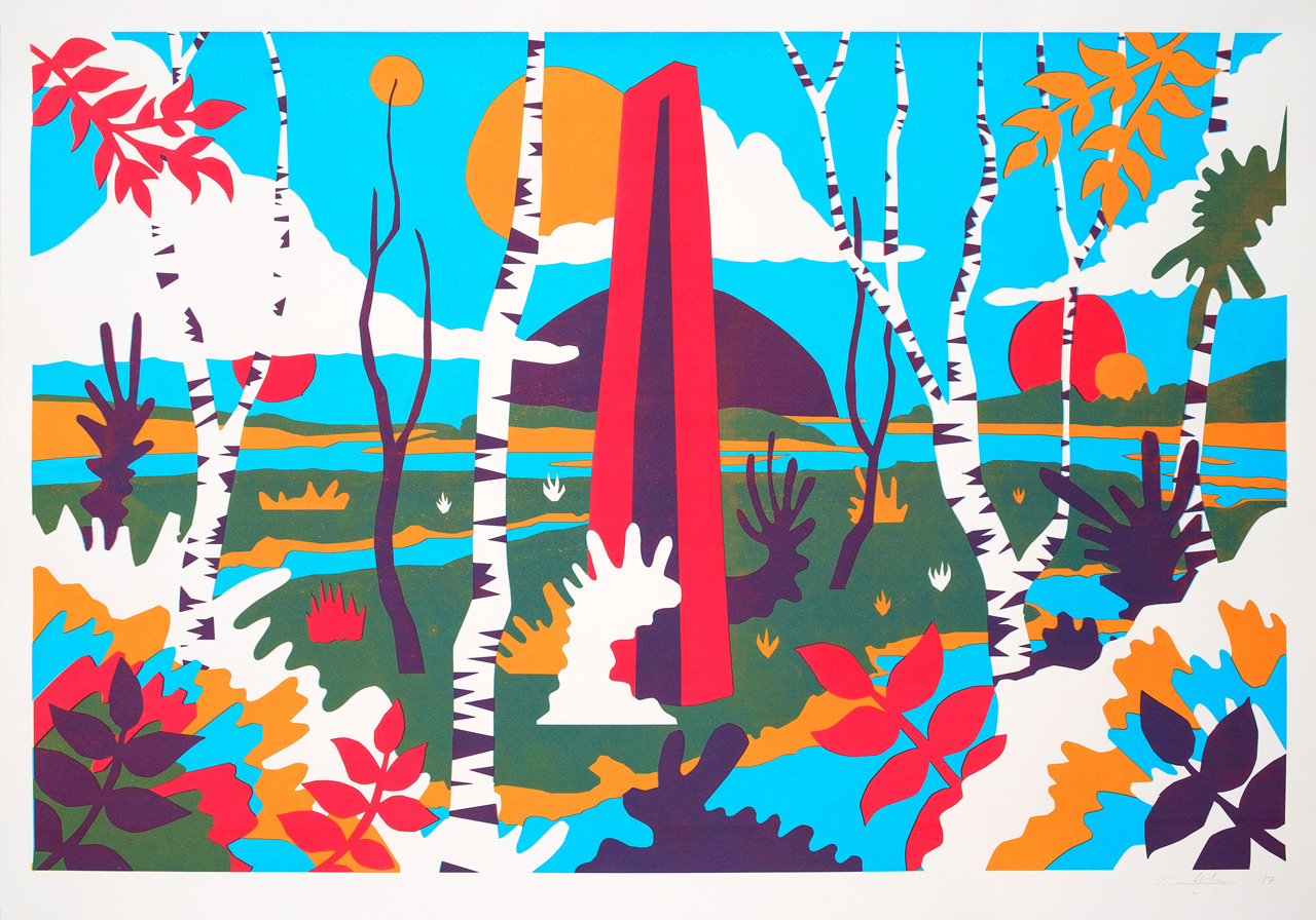
Nick Liefhebber is a multi-disciplinary artist who’s worlds splinter and consume the liminal dimensions of inner and outer reality. Existing, as he tends to do, as a commercial graphic designer and an independant illustrator, his layered visual language becomes the texture that binds these two realms together.


Can you tell us a little about where you’re from, and how you describe what you do to strangers?
I’m living and working in Utrecht, The Netherlands. A medium to large city for Dutch standards but a small town for worldwide standards. Great place. I have my own studio in the city centre which is connected to a print studio, pretty lucky with that. I always tell strangers I’m an artists since people usually only can think of websites and logos when you say you’re a designer and I feel I’m not just an illustrator. Often I just name a bunch of projects I’m working on, which can be anything from packaging, fashion, festival campaigns to self initiated art projects.
How long have you considered yourself an artist, and what aspects of this initially attracted you to your practice?
I graduated around 10 years ago and I’ve been working on my own for about 7-8 years. I never thought of being an artist initially, but was always making stuff. I did an orientating course at the Art School in Den Bosch just for fun and then I saw it was something you could do for real. You could study and make a living with. I didn’t know anything about applied arts like illustration and design but soaked up everything I could. I think the thing that fascinated me most was that you can create your own stories.
“Because it was so functional there were rules about how things had to look, everything became a symbol and by combining symbols, stories were told.”


The amount of colour and texture in your works gives them so much depth. I’m not sure where my brain thinks it is when I’m looking at them. Where would you say you were when you’re making them?
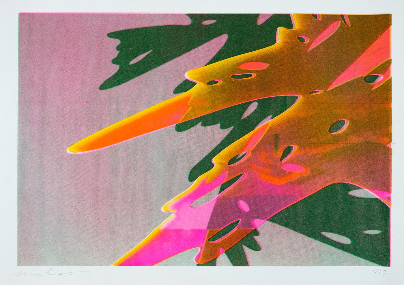
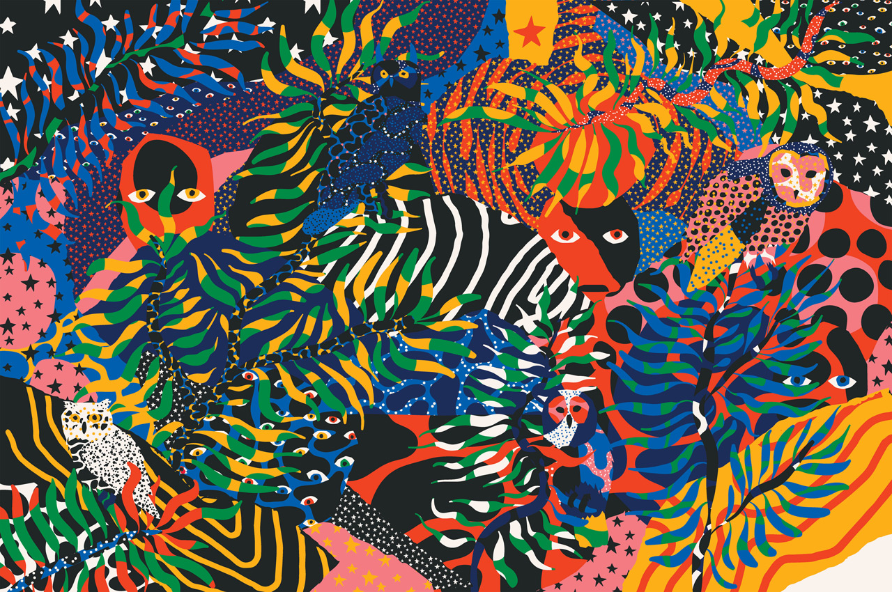
Great to hear! I want my illustration to look like diffracting light through leaves in the forest or reflecting light on the water. I think I’m just ‘there’ when working on those kinds of illustrations, and I work best when I plan whole days for that one project, without doing anything else like mailing or commissioned projects.
Because your illustrated worlds explode with so much colour, how do you chose which colours not to use?
That’s difficult to explain and I’m not sure myself, but I often select a few colours close to each other which I want to dominate, and add a contrasting one. I also try to limit the amount of colours, which can be hard sometimes. Since I’m doing a lot of screen printing I also make illustrations with a limited colour palette. Usually these are variations on primary colours because this gives nice results with overprint techniques.


How has growing up in Utrecht, and the spirit of the place effected your practice, if at all?
I grew up in Vught, a small village in the south of The Netherlands. I’m not really sure the location itself affected me. At least not in a way I can remember, but I think the way I was brought up might have affected me. My parents took me to (street) theatre and local music festivals, my father has a great record collection with loads of different music styles. My grandparents sometimes took me to museums like the COBRA museum as a child, they didn’t mind if I looked at the paintings or not, just walking through was ok as well. Just some examples, I think I had a pretty carefree youth with a lot of creative input.
Where does an image typically begin for you?
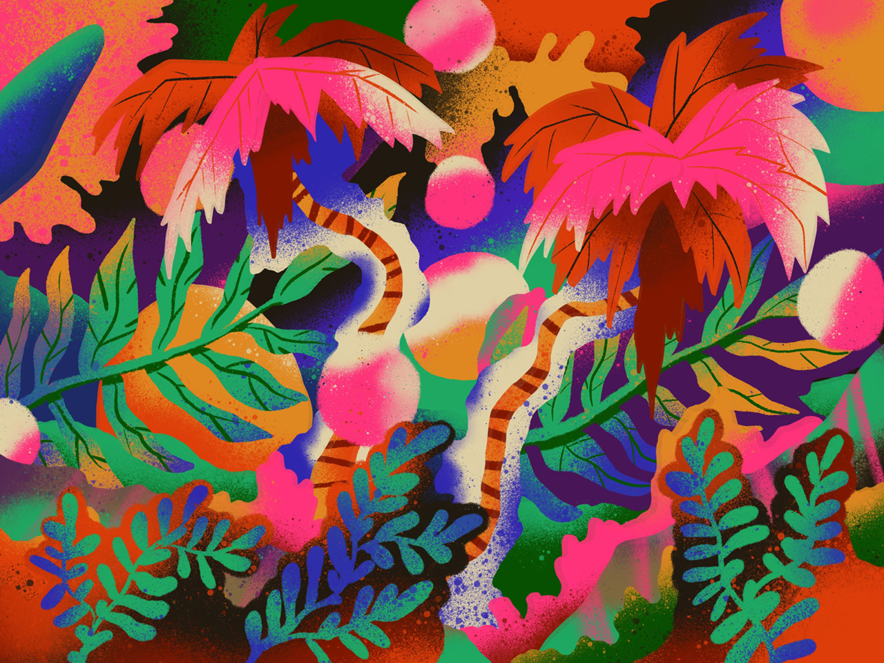
So after I came up with a general direction I start with building a set of shapes. A set of icons representing the meaning of the image, maybe a bit like hieroglyphs, both language and image. After that I do some very rough and quick sketches of the compositions, sometimes on paper and sometimes I move the shapes around finding a right composition. After that I start carefully adding and removing elements while changing colours all the time. It all comes down to when an image feels right.
I grew up in Vught, a small village in the south of The Netherlands. I’m not really sure the location itself affected me. At least not in a way I can remember, but I think the way I was brought up might have affected me. My parents took me to (street) theatre and local music festivals, my father has a great record collection with loads of different music styles. My grandparents sometimes took me to museums like the COBRA museum as a child, they didn’t mind if I looked at the paintings or not, just walking through was ok as well. Just some examples, I think I had a pretty carefree youth with a lot of creative input.
Where does an image typically begin for you?
So after I came up with a general direction I start with building a set of shapes. A set of icons representing the meaning of the image, maybe a bit like hieroglyphs, both language and image. After that I do some very rough and quick sketches of the compositions, sometimes on paper and sometimes I move the shapes around finding a right composition. After that I start carefully adding and removing elements while changing colours all the time. It all comes down to when an image feels right.
Do you have any creative rituals that guide you through your creative processes?
I guess the earlier mentioned cutting of paper shapes is a ritual in itself, it gives me time to think since it’s easy but time consuming. I also create hand drawn illustrations but the creation of a set of icons and shapes to work with is something that works best for me. I also listen to a lot of music, which can be anything. A few recent releases I really like though, are S-F-X, Ashinoa - Sinie Sinie and Pablo’s Eye - Spring Break, but I also have endless playlists and I listen to a lot of mixtapes on soundcloud.
I guess the earlier mentioned cutting of paper shapes is a ritual in itself, it gives me time to think since it’s easy but time consuming. I also create hand drawn illustrations but the creation of a set of icons and shapes to work with is something that works best for me. I also listen to a lot of music, which can be anything. A few recent releases I really like though, are S-F-X, Ashinoa - Sinie Sinie and Pablo’s Eye - Spring Break, but I also have endless playlists and I listen to a lot of mixtapes on soundcloud.


Who would you say you’ve been most influenced by, in terms of your philosophy and creative processes?
That’s really hard to say since I’m influenced by so many artists. I see myself as a designer and illustrator exploring art in my own experiments. Lately I’ve been looking at Japanese designers/artists like Kiyoshi Awazu and Tadanori Yokoo who also worked in a lot of different media. Illustration, photography, painting, typography. I think I like artists who apply their vision to different techniques, it results in very new work with a strong reference to their established work. I’m also very interested in patterns and inspired by folk art like rug and ornamental design. Especially since the moment I realised most of the elements represent something, for example a lot of Persian rugs are inspired by gardens so you see plants, trees, fountains etc. In that aspect I’m also inspired by ancient cultures with a strong visual language, Minoa, Egypt, Sumeria. It was very functional way of creating art, a way to share stories. Because it was so functional there were rules about how things had to look, everything became a symbol and by combining symbols stories were told. It’s the same way I work and maybe how all illustration works.
That’s really hard to say since I’m influenced by so many artists. I see myself as a designer and illustrator exploring art in my own experiments. Lately I’ve been looking at Japanese designers/artists like Kiyoshi Awazu and Tadanori Yokoo who also worked in a lot of different media. Illustration, photography, painting, typography. I think I like artists who apply their vision to different techniques, it results in very new work with a strong reference to their established work. I’m also very interested in patterns and inspired by folk art like rug and ornamental design. Especially since the moment I realised most of the elements represent something, for example a lot of Persian rugs are inspired by gardens so you see plants, trees, fountains etc. In that aspect I’m also inspired by ancient cultures with a strong visual language, Minoa, Egypt, Sumeria. It was very functional way of creating art, a way to share stories. Because it was so functional there were rules about how things had to look, everything became a symbol and by combining symbols stories were told. It’s the same way I work and maybe how all illustration works.
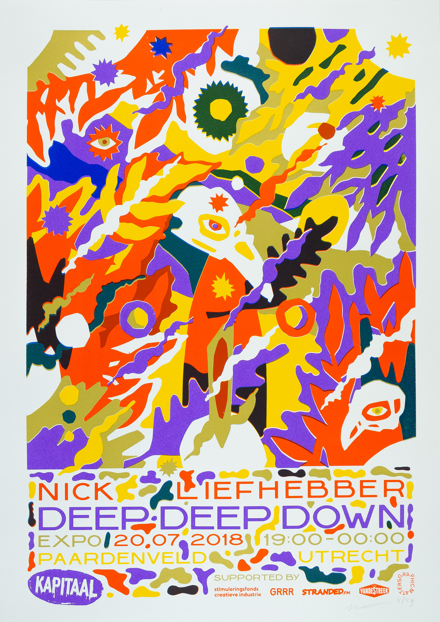
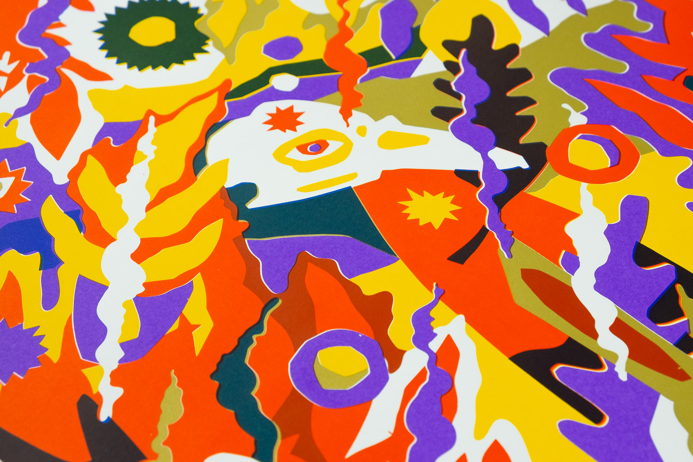
Can you tell us a little about one of your recent projects, Deep Deep Down?
Deep Deep Down was my most recent show at Kapitaal, a printstudio in Utrecht, the goal was to find new techniques which could add to my visual language. The title Deep Deep Down stands for the history which inspires me, uncovering layers of the past like an archaeologist. But also for the layers in my work, deep deep down int he image there are (hopefully) new elements to explore. Technique-wise I had been investigating photography and (simple) sculptures for a while so I created the shapes which I usually cut from paper from acrylic and wood both small and life size. Finally I combined those photographs with my flat illustrations again. So the project focussed on expanding my world and expanding my tools.
If you could go back in time and give yourself something valuable, what would it be?
Time, is that something you can give yourself? Anyway, I feel that’s the most valuable since I never have enough. Time and knowledge.