interview: patrick savile
︎Artist, Illustration, Interview
︎ Ventral Is Golden
interview: patrick savile
︎Artist, Illustration, Interview
︎ Ventral Is Golden
︎ Ventral Is Golden
Patrick Savile's work, like a true alchemical undertaking, stands astride two polarising planes. On the one hand a material, commercial plane feeds into his graphic design work, whilst the other plane is more ethereal, non-physical and spiritual. His compositions often nonchalantly merge these two planes together. We spoke to Patrick about where his ideas originate, and what we can expect of the future.

The aesthetic of your work seems so delicate. Like frost on a computer screen, but Japanese almost. It's really atmospheric. How would you describe the style that you find yourself in, and was this a conscious decision to move into it?
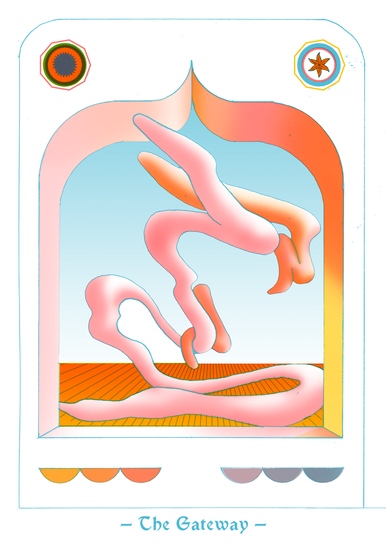
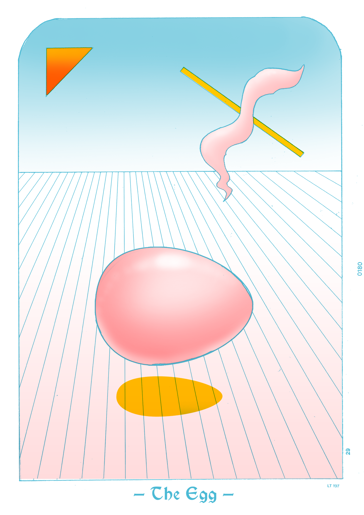
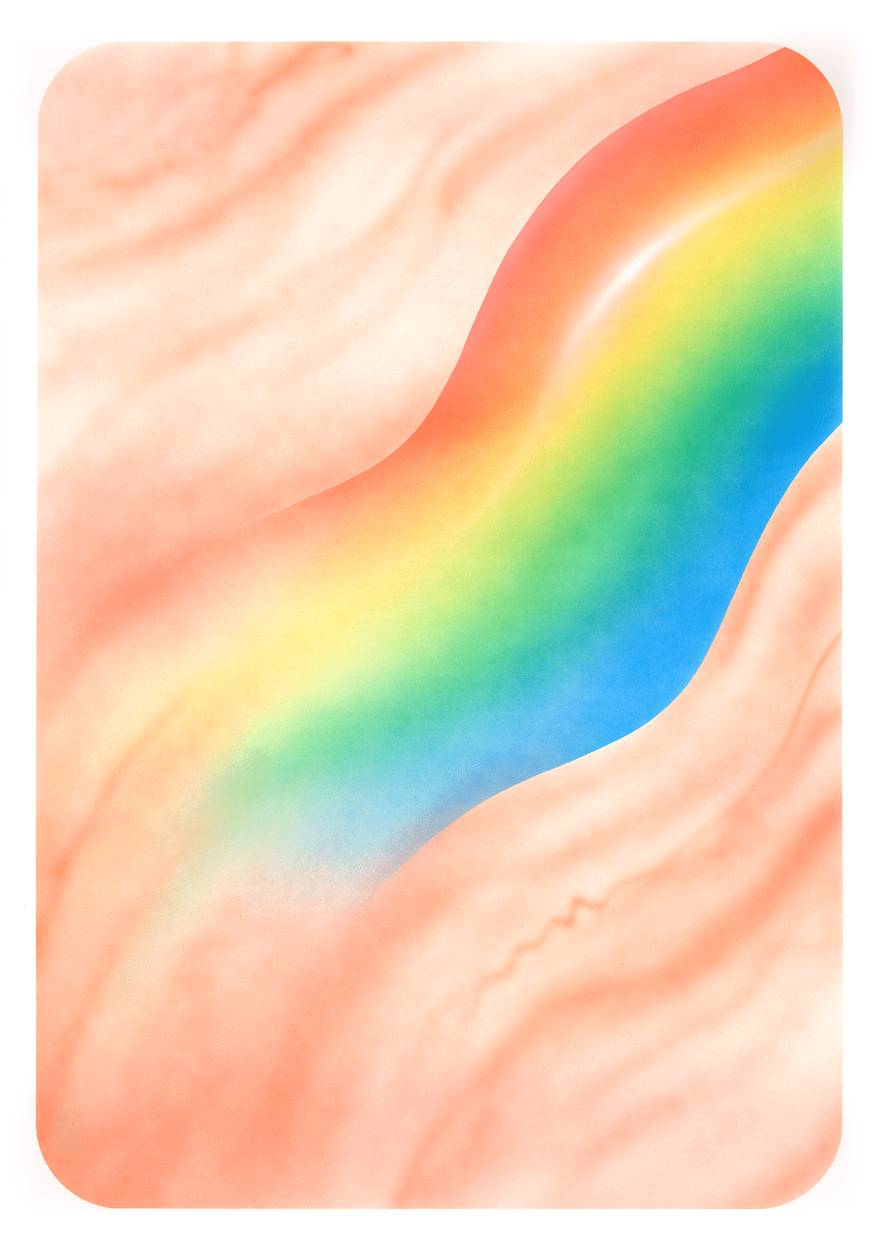
Much of it is, which I suppose comes from this kind of fantasy art I picked up from people like Moebius and Roger Dean growing up. Much of my work is a digital representation of the airbrush painting style, which inherently eschews the outline. I definitely chose to get rid of the outline, and work with light and shade. That said, I also enjoy quite a heavy handed approach- using line and pattern, which works better when a monochrome or screen print is needed, such as on t-shirts. This style lets me indulge in a more graphical, illustrative style, often incorporating more type and icon design.
Much of it is, which I suppose comes from this kind of fantasy art I picked up from people like Moebius and Roger Dean growing up. Much of my work is a digital representation of the airbrush painting style, which inherently eschews the outline. I definitely chose to get rid of the outline, and work with light and shade. That said, I also enjoy quite a heavy handed approach- using line and pattern, which works better when a monochrome or screen print is needed, such as on t-shirts. This style lets me indulge in a more graphical, illustrative style, often incorporating more type and icon design.

Can you tell us a little about the process you undertake to create one of your pieces?
I always start on paper and begin to draw full scale if possible, other times I may do a number of thumbnails, as the organic shapes I use have to have the right curves, which will only ever be possible if they come from my hand. Afterwards, I transfer the design to photoshop, usually by way of a photograph. Its a little counterintuitive, but I like doing this as it warps the art and gives it a layer of 'digital dirt', which is always good. I then clean up the lines and start to create layers of colour, masking off areas and painting in light passes, always using a soft brush, so you always get imperfect gradients and fills. This is an exact mimic of the process of doing an airbrush painting, just faster. Digitally I often end up with around five hundred layers.
![]()
I always start on paper and begin to draw full scale if possible, other times I may do a number of thumbnails, as the organic shapes I use have to have the right curves, which will only ever be possible if they come from my hand. Afterwards, I transfer the design to photoshop, usually by way of a photograph. Its a little counterintuitive, but I like doing this as it warps the art and gives it a layer of 'digital dirt', which is always good. I then clean up the lines and start to create layers of colour, masking off areas and painting in light passes, always using a soft brush, so you always get imperfect gradients and fills. This is an exact mimic of the process of doing an airbrush painting, just faster. Digitally I often end up with around five hundred layers.
You mentioned the method of airbrushing, but techniques aside, where do you draw most of your inspiration from for your artworks?
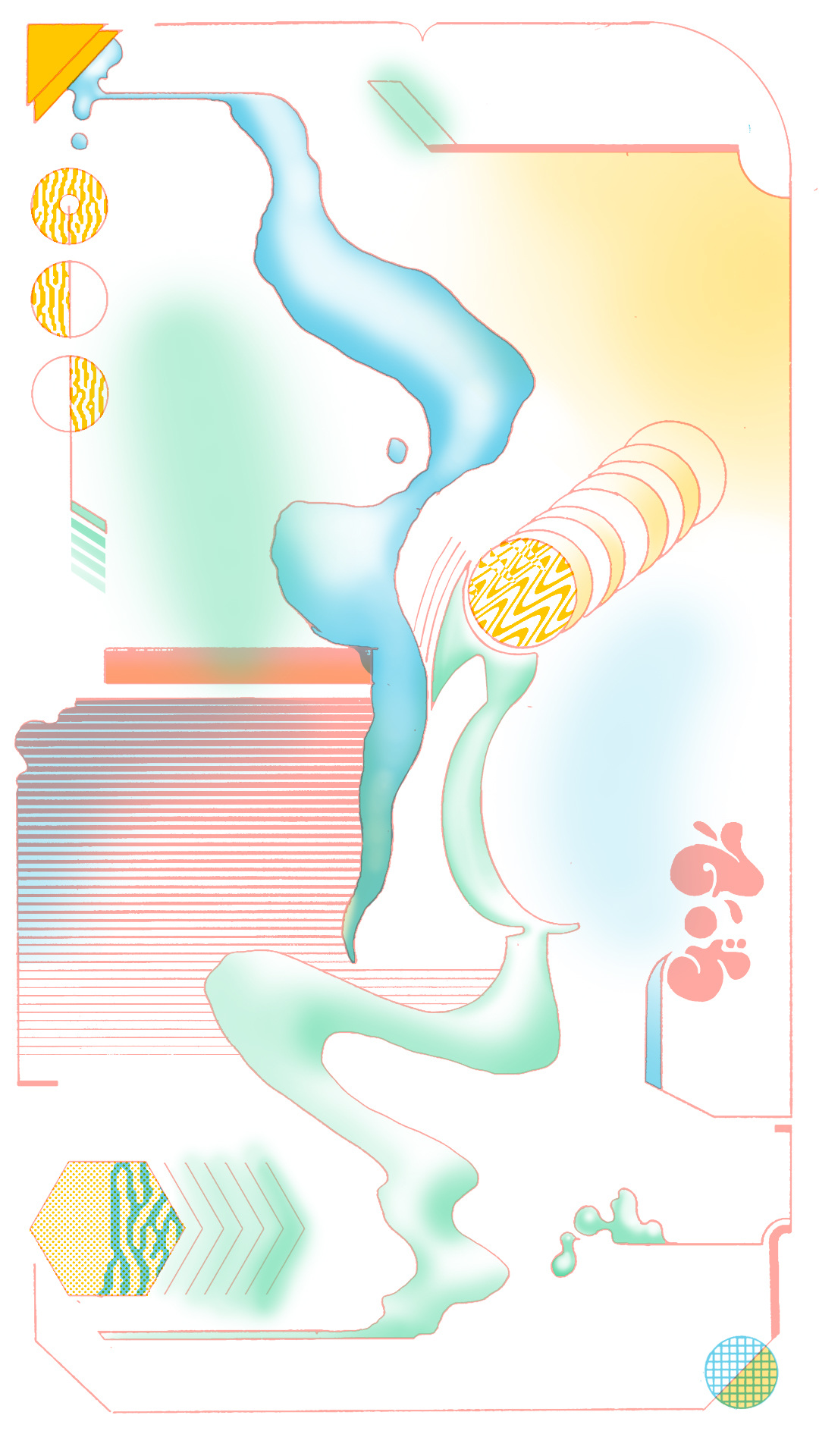
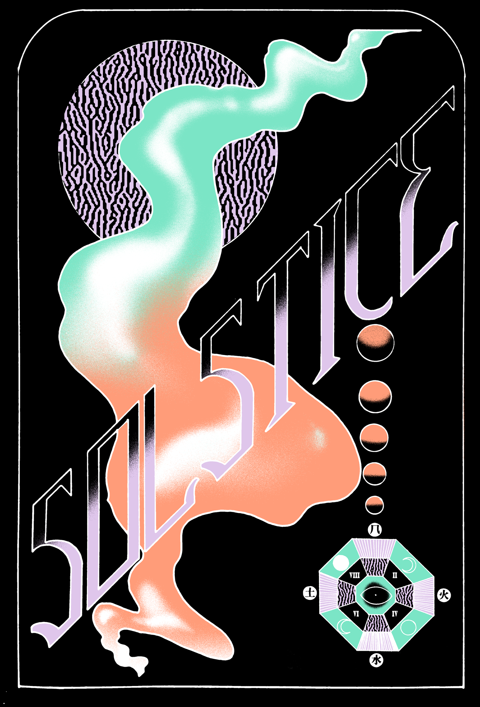
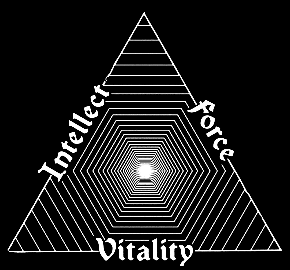
I love esoteric philosophy, and things like Chaos Magick and how the consciousness can be shifted and changed. Ambiguity and universality are important in my work. My series ‘Selected Scenes from the Beginning of the World’ is about how so many creation myths and cultural tales are similar around the world, and plays on the meaning behind weird visions that are depicted in said stories. This ties into my love of the Tarot. For me, Tarot pulls in so many different narratives and religious archetypes from much of Europe and further East. Meaning is created from common symbols being combined in different ways, which sums up so much art I suppose. Aesthetically I suppose Tarot inform a lot of my work as well. The composition and interplay with image and word really does it for me. Imperfection also plays heavily, which is why I love hand drawing things. Nothing is ever perfect; stray lines and marks and mistakes really imbues a piece of artwork with life. It feels more whole for me this way, and makes the whole thing more 'human'.![]()
I love esoteric philosophy, and things like Chaos Magick and how the consciousness can be shifted and changed. Ambiguity and universality are important in my work. My series ‘Selected Scenes from the Beginning of the World’ is about how so many creation myths and cultural tales are similar around the world, and plays on the meaning behind weird visions that are depicted in said stories. This ties into my love of the Tarot. For me, Tarot pulls in so many different narratives and religious archetypes from much of Europe and further East. Meaning is created from common symbols being combined in different ways, which sums up so much art I suppose. Aesthetically I suppose Tarot inform a lot of my work as well. The composition and interplay with image and word really does it for me. Imperfection also plays heavily, which is why I love hand drawing things. Nothing is ever perfect; stray lines and marks and mistakes really imbues a piece of artwork with life. It feels more whole for me this way, and makes the whole thing more 'human'.

Are there any artists who have influenced your artistic vision, and if so why?
The comic book writer Grant Morrison is an incredible force, who's work I've known for a while but only recently have learnt that he is his greatest character and a big proponent of Chaos Magick.
The way he thinks has been a big inspiration for me lately. Check out his passionate speech at Disinfo Con.
Hilma Af Klint’s work has had a strange seeping influence on me as well. Initially after seeing her work at an exhibition, I went away thinking not much of it, but it keeps returning to my head, and when I learned of her interest in Theosophy, it kind of made more sense to me. Visually I owe a lot to Moebius, and Roger Dean (who I mentioned earlier), Chris Foss; 70s airbrushed album art and book covers by David Pelham, Alan Aldridge and generally the design and typography from that period are really where it's at for me. I prefer to treat type as image, and the fonts from that period really feed into that mindset. Ken Price's biomorphic forms in his ceramic work and his line work seems to come from the same place as much of my own work. Currently there are some amazing artists working in the US who's work I'm feeling strongly. Loie Hollowell and Morgan Blair’s work is keeping me inspired every day.
![]()
The comic book writer Grant Morrison is an incredible force, who's work I've known for a while but only recently have learnt that he is his greatest character and a big proponent of Chaos Magick.
The way he thinks has been a big inspiration for me lately. Check out his passionate speech at Disinfo Con.
Hilma Af Klint’s work has had a strange seeping influence on me as well. Initially after seeing her work at an exhibition, I went away thinking not much of it, but it keeps returning to my head, and when I learned of her interest in Theosophy, it kind of made more sense to me. Visually I owe a lot to Moebius, and Roger Dean (who I mentioned earlier), Chris Foss; 70s airbrushed album art and book covers by David Pelham, Alan Aldridge and generally the design and typography from that period are really where it's at for me. I prefer to treat type as image, and the fonts from that period really feed into that mindset. Ken Price's biomorphic forms in his ceramic work and his line work seems to come from the same place as much of my own work. Currently there are some amazing artists working in the US who's work I'm feeling strongly. Loie Hollowell and Morgan Blair’s work is keeping me inspired every day.
“If you feel a connection with a piece of music for whatever reason, it brings comfort, and makes you feel more whole, and ultimately makes you feel more connected. The same is true with visual art.”
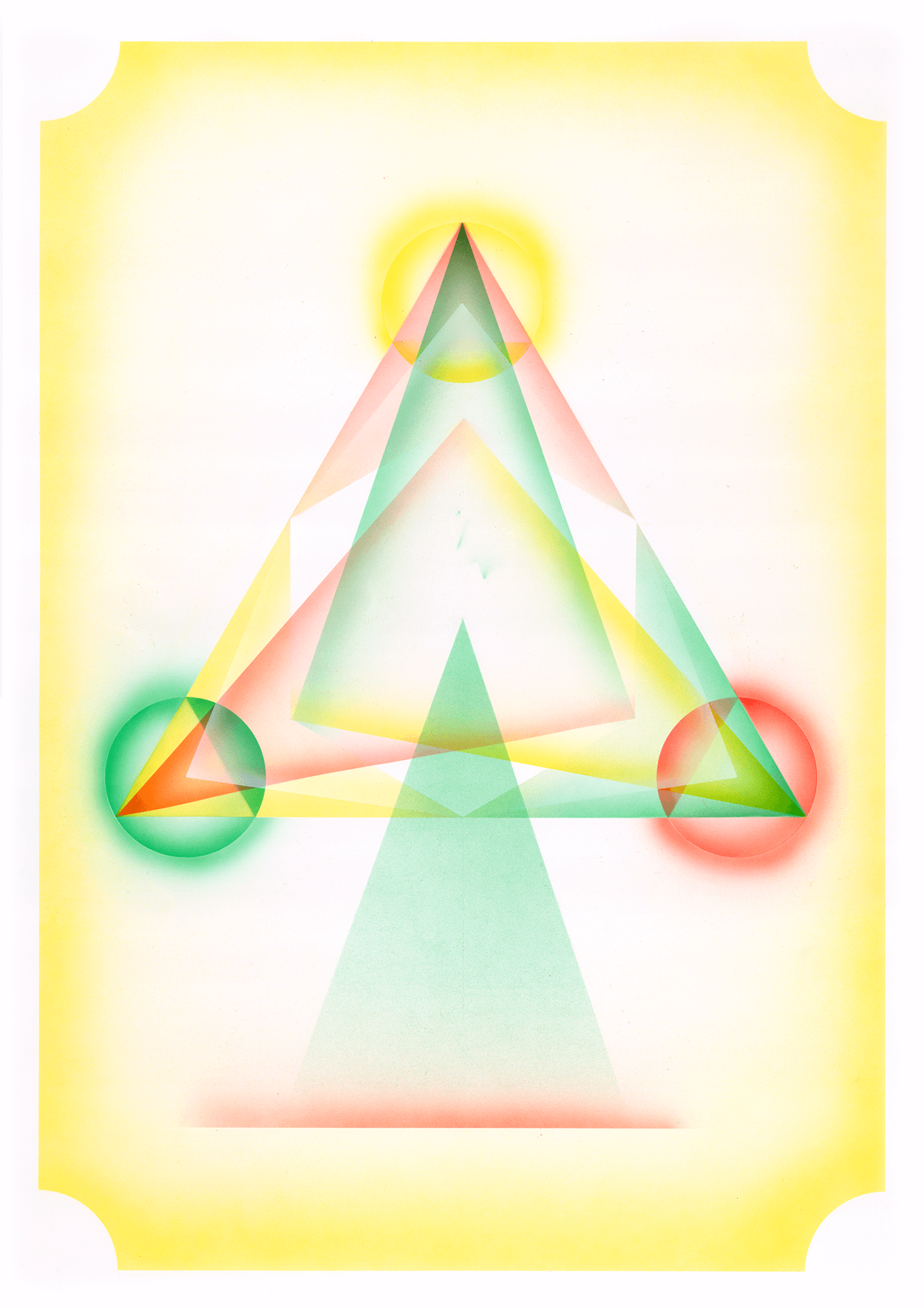

In most of your projects there seems to be an underlying language, with esoteric symbols trying to ease their way through onto the page. What relevance do these symbols have in our own linguistic and media saturated worlds?
They can mean as much or as little as you want. Each piece begins often with a word or phrase as the concept, and then through research, I create a narrative. I'll push the narrative through the use of icons, or symbols, though I never want it to be too obvious. People tend to want to ability of pulling associations and meaning from art, and I think that is important. If you feel a connection with a piece of music for whatever reason, it brings comfort, and makes you feel more whole, and ultimately makes you feel more connected. The same is true with visual art.
I like to have meaning behind everything I do, even if the end piece is just an echo of the original impetus, it creates a blueprint for why things should sit where they sit. A way of communicating some of that meaning is to use oblique symbols.
“I like to have meaning behind everything I do, even if the end piece is just an echo of the original impetus, it creates a blueprint for why things should sit where they sit.“
 What have you been working on recently?
I have been doing a few tshirt designs for different people, and some design work for new releases on Bokeh Versions, and Art Direction for a singer called Bonzai. She’s got a lot of good music coming out this year. I've got a solo show coming up in October in Peckham, so I'm starting to work towards that, its going to be paintings, though that’s as far as I’ve got. I'm still in the midst of making my own Tarot deck, but I feel I need a good run at it.
How do you like to spend your day when you are not making artwork?
I like climbing trees, drinking coffee, starting but never finishing books, and making music on occasion.
Have you produced any album art? How do you find the process of working with musicians?
Yeah, I've done some stuff for Lonelady on Warp, and some stuff for Sonic Router and currently doing stuff for Bonzai on Sony. It's great, and what I've always aimed to do commercially.
I appreciate the artist’s passion when I'm working directly with them, and though it's sometimes frustrating, as two visions often push and pull against each other, it's a rewarding experience. It's obviously way more fun when you're given free reign though, and I much prefer when I'm brought on board as an image maker. This way I can just get stuck in, and create something that I think really responds to the music. I'm doing a bunch with Bokeh Versions out of Bristol at the moment, and Miles who runs it is great at just letting me do my thing, which I hope leads to wicked releases. Watch for things coming out v soon.
 What kind of music do you listen to and how has this affected your artistic vision?
I go through phases, sometimes no music, just interviews and podcasts, but then the next day I flip to listening to 92 Prog House, then, like I did last week, listening to Judee Sill for three days. I really like getting stuck into a type of music and going deep, and switching it up, which I think sums me up. Visually I do the same thing.
Recently I have been listening to a lot of ‘Illbient’ and late 90s NYC trip-hop and the scene that was centred around the dot-com boom of pseudo.com. At the same time I've been watching interviews with R.A Wilson and Genesis P Orridge, which funnily enough turned out to be broadcast on the same website at the same time! So its all interweaving together at the moment. There's a strong atmosphere and aesthetic from that period which I want to delve into ever more so than I have before. I need more hours in the day really.
Further Reading ︎
Artist website : Patrick Savile
Austin Osman Spare
Theosophy
Lady Frieda Harris
Robert Anton Wilson
Bokeh Versions